Showing posts with label Chloe Campbell. Show all posts
Showing posts with label Chloe Campbell. Show all posts
Friday, 16 December 2011

Thursday, 15 December 2011
Evaluation- CHLOE
1) In what way does your media product use, challenge or develop forms and conventions of real media products?
The media product that my group and I created is labelled within the hip-hop genre. We did a lot of research into music videos from various genres and further research into the conventions of hip-hop music videos. From the research from group work and individual work, we formed a list of common conventions. These conventions included factors such as colour scheme, effects, mis-en-scene and style. With colour scheme, we found a common trend of bright colours with clips of black and white. One professional example of the videos we looked at which included this was ‘Word To Ya Mutha’ – Bel Biv Divoe. Which was a popular 80’s hip hop band. This use of colours gave a contrasting edge to the video which made them more interesting to watch. Although it was not always evident that the appearance of black and white scenes had any form of pattern or reason, we adapted this idea and added further meaning for our own music video. Our storyline is fragmented, with one part of the video telling a story and following a young, homeless drug addict who is searching for ‘sunshine’ and a way out (this part of the storyline is all in colour), and the other part of the storyline involves three separate urban looking females using direct address and rapping the chorus. The chorus is the only part of the video which is completely in black and white. This links with the storyline and indicates that these three women are trying to escape and sunshine and happiness. All the colour has been drained from their lives. Comparing this with the main character, whose life has a little hope left and so there is colour in her scenes. Another common convention was the use of effects. Hip Hop was popular within the 80’s and early 90s. This means that technology was not as advanced as it is today. Because of this important factor, even modern hip hop videos have stuck to its original conventions. One example of this is the music video for Ghetto Gospel by Tupac and Elton John. In this video it is evident that there are little effects and yet still a strong and powerful storyline. However, one of the effects that were commonly used in many of the hip hop videos that we analysed was the different styles of transitions. This included transition effects such as dissolves, fades, shaped cuts and swipes, which were all evident in the videos we looked at. With regards to this particular convention, our music video has challenged this and gone against what most hip hop videos conform to. In our own hip hop music video we used many different effects and used only a few, simple transitions, all with good reason. Our video included effects such as split screen (which was effective when showing two contrasting characters coming together), slow motion(this was used for emphasis on how slow time moves), sped up scenes(used for the mattress scene to show an ongoing event which lasted a long time for the main character), distorted scenes(such as the ‘CCTV’ effect used in the churchyard) and reversed scenes (used at the end of our video for effectiveness). We wanted to include all these effects to show up skill levels and to try and challenge ourselves whilst filming and editing. Although we have challenged the initial convention, we still tried to maintain the hip hop image through various other factors such as clothing and colouring. The transitions used in our video included only straight cuts and a cross-dissolve. We decided to keep it simple for a nice and professional balance between effects and transition. We did try out different transitions but it didn’t flow or compliment our video to any advantage. This is why we decided to challenge that convention but still managed to keep a hip-hop feel to the entire video. Whilst analysing multiple hip hop videos, we found that another popular convention linked with mis-en-scene was the use to staircases. Which doing further research into hip hop music videos, I was analysing Bel Biv Divoe's 'Word To Ya Mutha', and noticed that they included several scenes which showed people on staircases, with a total of four separate staircases and locations being used. I came up with many theories as to why staircases are so popular within this genre. One reason was that it could be to gain height and show superiority. This idea of being superior on a staircase can be emphasised by the camera angle being low and using a worm shot. Another reason why staircases could be popular within this genre is that it was common in suburban areas of America (where hip hop originally became popular) to have a staircase lead up to the houses. This idea then links to the stereotypical view that people within this genre are very strong and supportive of family life and life on the streets where they live. Whatever the real reason may be, we knew we could interpret this clear convention into our own music video. We have two scenes which include two different staircases. They can be seen within the first two choruses and the camera angle is slightly lower to give each of the actors a ‘superior and threatening urban’ attitude. Aside from looking at hip hop conventions alone, we also did research on Goodwins Analyse. One aspect of Goodwins Analyse to look at was genre characteristics. I feel that we took the genre characteristics on board very well and tried to include important conventions of hip hop whilst still keeping to a good storyline. Whilst giving a presentation on the conventions of hip hop videos, Leila asked the rest of the class to give their views and opinions on what they would expect to see in a typical hip hop video. The feedback was extremely useful and the answers we got we adapted to fit in with our video (answers included an expection to see things such as crime, sex, drugs, alcohol, gangs ect). From these named conventions, our storyline included aspects of crime, drugs, alcohol and gangs. With further research of our own we also discovered that another common theme used in hip hop music videos was religious references. The most obvious example we found for the theme was Ghetto Gospel – Tupac and Elton John. Even in the name it is apparent there is a religious reference. Within our own music video we included scenes within a church yard, another scene which passes a church and Jesus on a cross, stained glass windows in a church, a hand gesture which was religious and a prop which was a silver cross necklace. We wanted the religious references to be a reoccurring theme throughout the entire video to strongly link in with the genre characteristics. Another genre characteristic is the style of clothing. Within the Hip-Hop genre we noticed that there was mainly two different types of styles; 'stylish and expensive clothing' (which showed off how much money the artist had), and the other type wore more 'urban and street' styled clothing. Having our main character wearing stylish and expensive clothing was not consistent with our storyline of having a ‘homeless drug addict’ so we purposely chose to stick to 'urban and street' styled clothing such as the hoody which was often used as the main characters signature item, and also the denim jackets and the fluffy hat that the two actors wore within the choruses.
2) How effective is the combination of your main product and ancillary tasks?
Our main product was our music video which we spent weeks researching, planning and producing. Throughout our research it is clear how we found the conventions and how we became more familiar with the style of hip hop videos. Because of all the research we did this meant we could plan everything down to the last detail. We wanted to include certain locations (church yard to fit in the the reoccurring religious theme and the church where the main actress slept on a matress), certain acts and behaviours (drug taking, drinking alcohol and shop lifting) and certain effects during our editing (split screen for the effectiveness of two separate characters coming together). We wanted the right colours, the correct clothes and the most effective angles to use. We tried to combine everything together to make a perfect music video. But making a music video was only part of it, we also had to create a magazine advert and a digipak. Once more, we did a lot of research and planning for both of these tasks. Within the early stages of our planning we had already agreed that the image for the digipak cover and the magazine advert would be the same. This was a common trend in many genres, not only hip hop, and whilst doing research I found that artists such as Band Of Skulls, Paramore, Gwen Stefani and Wretch32 had all used the same image. Our main reasons for doing this was so that the artist could be easily recognised and hold a strong image. This was important as hip hop has quite a niche audience and so if the magazine advert/digipak appealed to another audience members then they would be able to recognise and remember who the artist is. Another important factor here is that we used the same character in all the tasks (music video and both ancillary tasks). This character is meant to be AIM (the artist). We wanted the artist to be present in all of this so the audience could form a relationship with her and find themselves attached on different levels to the artist. Even though it was important the keep the lead character strong, the most obvious theme that is carried throughout all these tasks is the reoccurring theme of religion. It is frequently shown within the music video and is also included in the artwork for both ancillary tasks (holding rosary beads with a cross hanging on it). We felt that this religious reference tied all three tasks together as our research had provided us with enough evidence to show that it was a common convention of genre characteristics to include some religious references. Not only is the artist holding rosary beads with a cross, but in the magazine advert the artwork has been edited on photoshop and an effect has been used to make the image look like a stained glass window, which is another obvious link to religion. Aside from religion, another effection theme we have throughout all three tasks which links and flows together is the colour scheme. With such a ‘dark and gloomy’ storyline, the video reflected the lyrics so the visuals where viewed in a slightly dimmed light. There were certain scenes in our music video where we purposely lowered the lighting to make the frames darker (the first church scene with the fight). We felt this made the scene more dramatic and edgy. The ‘dark and gloomy’ theme was then carried throughout our ancillary tasks as we used dark colours such as blacks and purples. Another colour we specifically used was red. This was to represent blood which links in with all the crime and gang violence which is stereotypically linked to the hip hop genre.
3) What have you learnt from your audience feedback?
During the process of researching about our genre (hip hop), Leila and I gave a presentation on what we thought the conventions where and explained some of our initial ideas for our own music video. During the presentation Leila handed out some paper and asked the class to write down one word each they would expect to see in a hip hop video. Feedback included words such as drugs, violence, crime, sex, gangs and minimal clothing. This was really useful as it allowed us to gain insight as to what the audience would expect to see in our own music video. During the planning stage, we continuously went back to our audience feedback and planned our storyline with them key words taken into extreme consideration. From the key words the class gave us our storyline was based around mainly crime, which scenes including drugs, violence and gangs (all words from the initial feedback we were given). Throughout the rest of the planning stage our storyline was constantly changing, but we always kept the audience feedback as an important source of how to structure the storyline. They also mentioned that we needed a clear idea on key aspects for the planning stages of the production which was to find set locations and cast members. We instantly started planning where we could film and who we could cast in our music video. Making relation to research, we decided to use a graveyard in a church as one of our main locations which links back to our reference to religion. We also decided that our main character in the music video should fit the conventions of our genre. Our inital idea was to use our friend Laura. She was African, took drama and was interested in hip-hop music. She seemed perfect for the role until we realised she wasn't as reliable as we hoped, so we quickly changed our minds and used one of our own group members as the leading role (Nia). Another way we gained useful audience feedback was by making a rough cut of our work so far and to present it to each of the groups in the media class. Each group would then give us feedback and say what they liked and didn’t like and also where they thought we could improve or do something differently. The rough cut we produced was 38 seconds long and included our opening scene and half of the first verse. Although this was only a short clip, we gained useful feedback which then helped us to develop the rest of our music video. First, we were told that our storyline wasn't that obvious. Although we went with the fragmented storyline, we still wanted the video to make sense. So we went back to editing and changed the order of a few clips so the storyline was easier to read and was instantly captivating. There was also positive feedback in that they liked the use of religious references and were all happy to see that we took their feedback on board and used this element often within our video.
We also got professional advice from our own media teacher, a media teacher at another school and an external examiner when our music video was viewed and briefly sent off. Our own media teacher came back to us with their combined feedback. They all agreed that our opening scene was good, but they didn’t like the point-of-view shot with the beer can and they also advised us to put in more close up shots. After receiving this feedback we immediately went back out to film more shots, even though we thought we had already finished filming and editing completely. After taking out the point-of-view shot we decided it would make sense to film the main character smoking. This scene would allow us to get an interesting extreme close up, fit in with the style of the character and also fit in with the hip hop conventions. After we had uploaded the new footage, edited it and then added it in to an appropriate place, we realised how important and useful the feedback we had received was. It had made us go back out and change a bit of a storyline, even though we thought we had completed everything. It also allowed us to get a wider variety of shots as we then included the extreme close up shot of the main character smoking. Not only did our media teacher give us advice here, but throughout the entire process had given us her personal opinion and feedback. She liked our initial ideas in the planning stages, helped us with our blog work (which we also won blog of the month on) and gave valid feedback and criticism against our music video throughout the entire process. An example of how her feedback influenced the final result of the video was when she told us to make it more ‘realistic’. By this she meant the conventions of all music videos, having a black fade in and fade out at the start and finish of the video and to have the artist name and song title appear briefly at the beginning. After we had made these few changes and added the extra details we noticed how much of a difference it has made. Our product actually looked like a genuine music video, and had we not have listened and taken on board this piece of feedback then it wouldn’t have included some of the main features which every music video is expected to have. With regards to our ancillary tasks (the magazine advert and the digipak) our main source of feedback was received from our own media teacher. We expressed our initial ideas with her and in return she gave us useful feedback. She told us that if we somehow managed to link all three products together then it would seem more realistic, genuine and professional. After discussing and planning a few ideas, we went with the idea of religion. Seeing as this was such an important aspect in our music video, we wanted to carry this through to both ancillary tasks to have a constant theme that would stand out. I sketched out a couple of ideas for the magazine advert, which we planned to produce first. Then as a group we chose the idea which we liked best and felt that it represented the style we were going for most. After we had taking photographs and uploaded them onto the Mac computers, we started to edit the magazine advert on Photoshop. We were happy with how the product was turning out and the feedback we received was all positive. Seeing as we didn't get any negative feedback from the magazine advert, we carried on and went onto producing our next ancillary product which was our digipak. From our reseach we decided it would be beneficial to use the same photograph for both ancillary products. However, even though we kept the same photograph, we edited the digipak image to make it look slightly different. After testing some techniques on Photoshop and trying out the effects, we knew we wanted to still keep the religious theme strong. We found an effect called 'stained glass' on the Photoshop software. This changed the image to make it look like stained glass, another reference to religion. We asked for the opinion of our teacher, who really liked the idea and said it was obvious what the links between all three products were. With her approval, we went ahead and carried on editing on top of the stained glass effect. After we had added some finishing touches such as text and positioning we were pleased with the outcome of our digipak. Without the advice and feedback we received we wouldn't have managed to produce such professional and linked products.
We also got professional advice from our own media teacher, a media teacher at another school and an external examiner when our music video was viewed and briefly sent off. Our own media teacher came back to us with their combined feedback. They all agreed that our opening scene was good, but they didn’t like the point-of-view shot with the beer can and they also advised us to put in more close up shots. After receiving this feedback we immediately went back out to film more shots, even though we thought we had already finished filming and editing completely. After taking out the point-of-view shot we decided it would make sense to film the main character smoking. This scene would allow us to get an interesting extreme close up, fit in with the style of the character and also fit in with the hip hop conventions. After we had uploaded the new footage, edited it and then added it in to an appropriate place, we realised how important and useful the feedback we had received was. It had made us go back out and change a bit of a storyline, even though we thought we had completed everything. It also allowed us to get a wider variety of shots as we then included the extreme close up shot of the main character smoking. Not only did our media teacher give us advice here, but throughout the entire process had given us her personal opinion and feedback. She liked our initial ideas in the planning stages, helped us with our blog work (which we also won blog of the month on) and gave valid feedback and criticism against our music video throughout the entire process. An example of how her feedback influenced the final result of the video was when she told us to make it more ‘realistic’. By this she meant the conventions of all music videos, having a black fade in and fade out at the start and finish of the video and to have the artist name and song title appear briefly at the beginning. After we had made these few changes and added the extra details we noticed how much of a difference it has made. Our product actually looked like a genuine music video, and had we not have listened and taken on board this piece of feedback then it wouldn’t have included some of the main features which every music video is expected to have. With regards to our ancillary tasks (the magazine advert and the digipak) our main source of feedback was received from our own media teacher. We expressed our initial ideas with her and in return she gave us useful feedback. She told us that if we somehow managed to link all three products together then it would seem more realistic, genuine and professional. After discussing and planning a few ideas, we went with the idea of religion. Seeing as this was such an important aspect in our music video, we wanted to carry this through to both ancillary tasks to have a constant theme that would stand out. I sketched out a couple of ideas for the magazine advert, which we planned to produce first. Then as a group we chose the idea which we liked best and felt that it represented the style we were going for most. After we had taking photographs and uploaded them onto the Mac computers, we started to edit the magazine advert on Photoshop. We were happy with how the product was turning out and the feedback we received was all positive. Seeing as we didn't get any negative feedback from the magazine advert, we carried on and went onto producing our next ancillary product which was our digipak. From our reseach we decided it would be beneficial to use the same photograph for both ancillary products. However, even though we kept the same photograph, we edited the digipak image to make it look slightly different. After testing some techniques on Photoshop and trying out the effects, we knew we wanted to still keep the religious theme strong. We found an effect called 'stained glass' on the Photoshop software. This changed the image to make it look like stained glass, another reference to religion. We asked for the opinion of our teacher, who really liked the idea and said it was obvious what the links between all three products were. With her approval, we went ahead and carried on editing on top of the stained glass effect. After we had added some finishing touches such as text and positioning we were pleased with the outcome of our digipak. Without the advice and feedback we received we wouldn't have managed to produce such professional and linked products.
4) How did you use media technologies in the construction and research, planning and evaluation stages?
During the research stages in the production of our music video, the only form of media technology that we used was the internet. Although we only used one media technology, this was all we needed to provide us with the information we needed and we used it throughout the entire process. The main three sites we used were Blogger.com, Youtube.com and Wikipedia.com. Blogger.com was used by everyone in the media group to keep track of work and to store all of our media work. Youtube.com was used a lot to look at various videos from various artists which we would then analyse and gain ideas from. Lastly, we used Wikipedia.com frequently as a useful source for finding out about the facts we needed for our research. We also used many other sites, some which were more useful than others, but these are the three main sites that we used throughout the whole process. Next was the planning stage. Our two main pieces of media technology equipment used was the Canon video cameras and the Apple Mac computers (which includes the software ‘Final Cut Pro’ which we used to edit our footage on). Before we went out and started to film, we took test shots on the Canon video cameras and ten uploaded this footage using a USB lead to the Apple Mac computers. Once the footage was uploaded we used Final Cut Pro to edit our trial footage. This allowed us to play about with the effects and get use to the important features that we would later be using to help edit our final piece (tools such as the cut tool, the audio tools, different effects, and livewire). Once we felt comfortable with using the video camera and how to use Final Cut Pro, we began to properly plan our storyline and went straight out into filming the actual construction of the music video. The construction stage of our music video introduced us to many different forms of media technology. We carried on using the Canon video cameras throughout the entire process. The cameras were very professional, which allowed for good quality. The cameras were also very heavy, but we dealt with this by using a tripod for most of the shots. One of the main reasons I enjoyed using this particular video camera was because it allowed us all to what what we were actually filming without having to individually look through the viewfinder. The camera had a section which you could pull out and view the scene that was being shown digitally. This made filming a lot easier as we could all see what was going on at the same time. Once we had finished filming, we uploaded the footage using a USB cable which linked to the Apple Mac computers. We had to rewind the tape in the camera back to a certain point and then press 'play' on the camera and 'capture' on the Mac, this allowed all the footage being played to be captured so we could then edit it.After it was all uploaded, we used Final Cut Pro to view the footage and decided which parts were good enough for the video. Editing took a long time, providing many complications and stressful hours. On occasions our work would not be saved and so we learnt to constantly save our work and check it was always there in case the computer had not saved it properly. Another issue we had with the technology we used was the parts of our footage would not upload onto the computer and was never found. This was extremely frustrating for us as a group but we carried on filming and editing. We used Final Cut Pro to put together our entire video (the editing side). We did this by cutting certain scenes and putting them together. We converted the track (Sunshine) onto iTunes by saving it to the computer from a CD, after it was uploaded we inserted the track onto our editing piece. This allowed us the make sure the scenes were in time, which was critical for the lip syncing scenes in the choruses. After we had finished editing, we converted our music video into Quicktime. We changed a few settings like the size of the video and sound format, all of which the changed settings allowed the video to be observed in a higher quality. For the ancillary tasks, we used the camera on the Canon video camera. This seemed suitable as it was still of a high quality and allowed us all to use the digital viewer so we could all see what was being shown on the screen. Once more, we uploaded the images to the Apple Mac computer using the USB cable and got straight to work. We first started on the magazine advert. We used a template that was given to us and used he Photoshop software to edit the image. We used different effects such as enhancing the contrast, the burn tool and effects such as 'stained glass', all of which make the magazine advert fit the conventions of our genre and make it creative and professional. Next we produced the digipak, once more using Photoshop and a template. The template was useful as it kept our images a certain size and made the entire process a lot easier.Within the evaluation stage we created a commentary. We did this by filming ourselves talking about everything we have done so far. We wrote out a script (which we enlarged on another computer for us to remember key lines when filming) and set up a camera and tripod in the media suite. Using the small pull out digital screen allowed us to position ourselves accordingly and watch ourselves as we spoke into the camera. After we had finished filming we went through the same routine of uploading the footage using a USB cable and editing it all on Final Cut Pro. Once all the editing was complete and we were happy with the final product, we changed the settings and converted it over to Quicktime.
Monday, 21 November 2011
FINAL MAG AD !

Here is the final result of one of our ancillary products, our magazine advert. The same image here is used again in the digi-pak as we felt it was important to have a continuous trend throughout our products. Here, Leila, Chloe and i chose to use a stained glass window effect as it blocked the colours really well. Furthermore, our research supported our decisions to use a red and white font. We chose to use the logo of 'island records' as a hypothetical image. Also, we displayed a possible retailer for the up and coming digi-pak. I feel that this image is powerful and strong as such things as the facial expressions and the use of the cross are very dominating of the photo. Also, we felt that it would be effective for the artist's name 'AIM' to be the only thing displayed at the top of the image. This follows the conventions we discovered as we found that majority of hip-hop artists like to place a title in an area where it will catch the audience's eyes.
Different font styles on Hip-Hop adverts


These are the four different examples of magazines within the Hip-Hop genre. I want to try and focus on the font styles as there will be a lot of text on the magazine advert that the group and I produce. Text is an important part of the magazine advert as the font style must fit in with the genre and represent it. With the examples above you can see that the fonts used are big and bold.
This gives the magazine a 'hard edge' which many Hip-Hop artists try and achieve.
This gives the magazine a 'hard edge' which many Hip-Hop artists try and achieve.

I have found some examples on Microsoft Word that I felt would be suitable for the design of the magazine advert that my group and I will be creating. All of these font examples have similar characteristics (bold, solid and strong), which fits with the conventions of a Hip-Hop magazine. Because the genre we are working with isn't mainstream and has quite a niche audience, the advert will mainly be viewed within a Hip-Hop styled magazine. And so for this reason our advert must link with the conventions of the entire magazine.
I got some feedback from people so we could come to a conclusion about which font would be most appropriate to use.
Chloe (myself): Personally, I prefer Rockwell and Bold Ariel Black. I think that these two fonts have a powerful and cool feel to them which is what we want our artist (AIM) to represent
Courtney: Elephant, because it's plain and yet still catches your eye.
Leila: Rockwell and Vineta BT - Because I have also looked into Hip-Hop magazine adverts I am aware of the style used and I think Rockwell would look good in a wide range of colours. And it's also quite hard and solid, just like the personality of a gangsta.
Nia: Ariel Black and Bondini MT Black
After looking at the results and the resoning of these, my group and I have decided the the font which is best suited for our own magazine advert is Ariel Black (in bold). This font holds the strong and yet simple style which we are trying to maintain in a visual sense.
I got some feedback from people so we could come to a conclusion about which font would be most appropriate to use.
Chloe (myself): Personally, I prefer Rockwell and Bold Ariel Black. I think that these two fonts have a powerful and cool feel to them which is what we want our artist (AIM) to represent
Courtney: Elephant, because it's plain and yet still catches your eye.
Leila: Rockwell and Vineta BT - Because I have also looked into Hip-Hop magazine adverts I am aware of the style used and I think Rockwell would look good in a wide range of colours. And it's also quite hard and solid, just like the personality of a gangsta.
Nia: Ariel Black and Bondini MT Black
After looking at the results and the resoning of these, my group and I have decided the the font which is best suited for our own magazine advert is Ariel Black (in bold). This font holds the strong and yet simple style which we are trying to maintain in a visual sense.
Artwork for both the digipak and the magazine advert
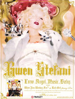
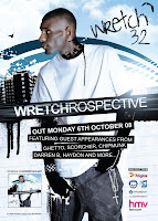

These are examples of magazine adverts from a variety of genres (Hip-Hop, Pop and Indie). My group and I had an idea that the artwork used on the Digipak and the artwork for the magazine advert were to be the same. This is a common convention throughout all genres. A good reason to do this is so the Digipak can be easily recognised by the public as they wont mix up images. This is useful as the genre of Hip-Hop usually reaches out to quite a niche audience, and so the use of the same image means that if different people see the same image, it will become more familiar and various people will remember it.
We are still to plan out our initial ides for both of the ancillary products, but we have already found and backed up our reasons for why we want to use the same image on both the magazine advert and the digipak.
Wednesday, 16 November 2011
Photoshop trials for magazine and album artwork
Because neither Leila, Nia or myself have much experience with using Photoshop, we wanted to try out different effects on our test images to decide what looked most effective for our artwork.

I (Chloe) edited this image. I enhanced the contrast to make the eyes look more blue and intense. Raising the contrast also made the fur on the hood of the coat stand out more and gave it an almost 'halo' effect which the group had discussed and liked. For the background, I used the 'burn tool'. This allowed me to darken the background and take away the detail which was behind the actress. I also used the 'burn tool' on her knuckles to give a 'bruised effect'. Although this doesn't look very professional in the edited image above, the group agreed that this was a good effect and links in with the image we are working towards. A problem I had with editing this image was that certain areas in the background were too bright (the light reflecting on the window) which caused some areas the edited image to have an outline of neon blue. I will either have to find away around this problem or have to find a new effect to use.

Although this is not one of my favourite effects I used, I do like the 'sketchy' look that it gives the image. I used the effect called 'dark strokes' within the 'brush strokes' file in filters. I think that this effect makes the image look a little blurry which gives the idea that the actress is not entirely sober. The face also appears soft, clean and bold. These are the exact characterises we wanted to give the actress to fit the conventions of the genre and to make the audience sympathize with her.

On this image I (Chloe) wanted to make the artwork appear 'cartoony' and yet still have a 'dark' feel to it. I raised the contrast to its fullest and decreased the brightness. This gave a shadowy effect in certain areas around the face. I then used the 'cutout' effect under the 'artist' filters. This gave the image the 'cartoony' effect I was trying to achieve. It completely cuts out the face but still shows features of the nose so it is evident where certain features are. The background behind the hooded character also has a 'graffiti' type effect running down from the walls, this is linked into the Wretch 32 magazine/digipak artwork.

I ( Leila) chose this particular image of Nia to edit. I used a dark contrast on the image around certain areas to exaggerate a dark feel particularly below the eyes to create a thuggish threatening look ( to show her hard-life on the streets) and also around Nia's face to draw attention to her facial expression. I also used the 'curve tool' to highlight certain features like the fur on her hood to represent light behind her ( a halo figure as it were) because religious themes occur throughout our music video. I altered the saturation to make the image look black and white because it follows most hip - hop/rap conventions .

I (Nia), edited this image using photoshop. The first thing i did was use a lasoo tool to cut around the image of myself to change the layers and add a separate background. I wanted to create an image that reflected our sketches as much as possible therefore i chose to insert a different background. In one of my sketches i used a bright light coming behind the image of myself. Furthermore, i chose a red font which sticks to the conventions of hip-hop and i chose to display this above and below the picture. The expression on my face was supposed to represent hardship and anger. We didn't want this image to come across as positive or happy as hip-hop tends to be quite depressive. I also blurred the edges of the image to make it appear slightly more blended in to the background. Furthermore, i used a burn tool on my hands and face to make the image appear distressed. We wanted the image to encourage people to feel sympathy for the character as well as feeling slightly intimidated by them.
All these images were test shots and we intend to deliver our final digi pak and magazine advert to a higher standard than these test versions. However, it has given us a good insight into particular shots and effects we may want to chose in the final version.
Test images for our own digipak and magazine advert
Once we had decided which sketch to use from our inital ideas for artwork, we set out and shot some images. We practised with different angles and different styles so we could see what worked best.
These images were taken around our school grounds. We took these test images on the stairs because it fitted the forms and conventions of the hip-hop research we had concluded. From our research we found that there was a common use of stairs in hip-hop videos and images, therefore we found it appropriate to stick to this idea.


From these test images we will test some effects on Photoshop and decide what image works best and represents the Hip Hop style for out magazine/digipak in the most effective way. We played around with high and low angles and slightly closer shots.

 These images of the crosses were taken as test shots in order to see how clearly the cross would be displayed. It shows how we have developed our ideas into physical products as we have clearly played around and tested with potential locations and styles for our images.
These images were taken around our school grounds. We took these test images on the stairs because it fitted the forms and conventions of the hip-hop research we had concluded. From our research we found that there was a common use of stairs in hip-hop videos and images, therefore we found it appropriate to stick to this idea.


From these test images we will test some effects on Photoshop and decide what image works best and represents the Hip Hop style for out magazine/digipak in the most effective way. We played around with high and low angles and slightly closer shots.


Sketches for our Digi Pak
I've created 3 designs for our DigiPak. They show the experimentation we've used where we've been considering using an image or a person, and how this fits in with the conventions of hip-hop.
The first picture is of the main actress ( myself) looking down using a distressed expression. This is a common convention in the hip-hop genre, to show some sort of anger or sadness on the cover. Furthermore, it is quite common in modern day today that an artist use an image of an actress from their music video, or themselves on the front of their CD cover.
The second picture is of an image of a cross which fits the convention of hip-hop again as we have highlighted a lot of music videos using religion. I've added black and red colours to the image as again this fits the convention from our research. Also, this maintains the religious theme that we have consistently used in our music video.
The third picture is the track list which again continues the theme of the red and black through the font . I've Incorporated the same cross from the first image into this last image to keep the theme the same. The same colours of red and black are used as a majority of hip-hop artists tend to use 2 main different colours when producing and album cover.
 As you can see the possible retailers are included here, we've included the artist's myspace name and the date of release. Our artist's name is also on the album cover.


The first picture is of the main actress ( myself) looking down using a distressed expression. This is a common convention in the hip-hop genre, to show some sort of anger or sadness on the cover. Furthermore, it is quite common in modern day today that an artist use an image of an actress from their music video, or themselves on the front of their CD cover.
The second picture is of an image of a cross which fits the convention of hip-hop again as we have highlighted a lot of music videos using religion. I've added black and red colours to the image as again this fits the convention from our research. Also, this maintains the religious theme that we have consistently used in our music video.
The third picture is the track list which again continues the theme of the red and black through the font . I've Incorporated the same cross from the first image into this last image to keep the theme the same. The same colours of red and black are used as a majority of hip-hop artists tend to use 2 main different colours when producing and album cover.


Tuesday, 15 November 2011
Sketch ideas for our own magazine advert
From looking at three separate magazine adverts of three individual Hip Hop artists, we have come up with a few sketch ideas of what our magazine advert could look like.
Once we have decided on which sketch to use we will then be experimenting with Photoshop and colours.

We have decided on three inital sketch ideas, all with certain elements and conventions linked in with our own research we have done by looking at different magazine adverts.

Sketch 1
In this sketch the main character (the same one from our music video) is seen in a hoody holding a cross. There is a glowing light behind her and her knuckles are bruised. All of these factors are seen as contradictory, which was our aim. We wanted the audience to feel sympathy for the character, and yet still remember she is 'from the streets' and does not lead a very positive life. This is portrayed by the style of her clothes being quite thuggish contrasted with the person holding a cross. This shows both her 'street' side which is harsh and cruel, and also her religious side in which she prays and hopes for something better. The bruised knuckles show that she has gotten in fights and lives it rough, whereas the glow in the background acts as a 'halo' type effect and gives the impression that she is actually pure and holy. We liked this idea a lot as we felt it portrayed the image we were going for well.

Sketch 2
This idea contains a gang member sitting on a staircase holding a baseball bat. Each of these aspects link back to our genre. 'Gang members' were mentioned to be related to the Hip-Hop genre when we first asked for feedback to the class about what they expected to see in a Hip-Hop music video. The staircases were found as a convention through my own research whilst looking at videos such as 'Word To Ya Mutha'. And a baseball bat is seen here as a weapon, which links in with gangs and crime, another common convention of the genre. Although it includes many common aspects and elements, we found that there was a lot going on visually in this advert, which mean there was hardly any room for text to provide information about the artist.

Sketch 3
This idea consists of a red cross on a plain background. The use of the colour red symbolizes blood and death, which is a reference to our music video. The cross is a religious reference, which was a common theme in the music video that we intended on carrying on to both ancillary products. The plain background allows the audience to mainly focus on the red cross and emphases its importance. There is not a lot of text, but there is enough for the audience to get enough information about when the album is released and where it is available.This idea would be easy to produce on Photoshop as it is a very simplistic design.
As a group, we have all decided that sketch 1 best represents the style and genre that we are working with (Hip Hop). We tried to hit the main conventions and to make it as realistic as possible.
Comparing a Hip Hop magazine advert with another genre


For a bit of further research I have decided to compare two magazine adverts from different genres. The advert on the left is to promote a new album for a mainstream Pop/Indie band called The Zutons. On the right hand side is the same magazine advert I have already evaluated by Wretch 32 (mainsteam Hip Hop artist). The point of this extra research is to find the main differences between the two genres in the way each of their adverts present themselves so my group and I can get a good idea of all the conventions that a Hip Hop magazine advert needs compared to other genres.
Text styles
One of the first differences I noticed between these two adverts was the style of font used. In the Hip Hop advert (Wretch 32) the font is bold, simple, easy to read and solid. In comparison, the Pop/Indie advert by The Zutons has a lot more detail and more of a theme. For example, there is a lot more use of colour (red/yellow/white), many different styles (bold/italic) and an obvious use of many different font styles. This may be explained by the Hip Hop genre having more of a niche audience, and so their style of writing (hard and bold) fits only their conventions. Whereas the Pop/Indie advert is more diverse, and so they have a larger target audience in which they must make appealing to many different people.
Artwork
Another main difference I noticed instantly was the use of artwork. In the advert for the Hip Hop artist, there is a portrait of the artist with a use of 'graffeti' styled effect. Comparing this to the other advert, the Indie/Pop advert does not include any of the band members and is a cartoon which resembles an old movie poster. Because The Zutons are a mainstream band, they may not need to be shown in the media and to the public as often as the other artist (Wretch 32) because they are already known. However, Wretch 32 (although a popular artist within his niche genre) is not as mainstream and popular, and so his advert may include his photograph to promote himself more and make him more appealing to new people of the public who have never seen his or heard his music before.
Information included
Both of these adverts display completely different information to one another. The Zutons' poster has information about featuring songs, critical quotes and includes the band name. The other magazine advert for Wretch 32 also has the artist name, but has no information about featuring songs or critical quotes. This may be because the Hip Hop genre likes to 'let the music speak for itself' and so feels that critical quotes are not needed. Also, their songs may not be as well known and popular. So instead of including featuring songs like a Pop magazine advert may have, Wretch 32 (representing the Hip Hop genre) has information about featuring artists. This is beneficial for the niche genre (compared to mainstream Pop music) as people who listen to other artists mentioned on the advert may then listen to Wretch 32's music. This is a clever and subtle way to self promote the artist himself, and other artists who are featured on his album. The Hip Hop advert includes much more information than the Pop advert. Including album release date, where to purchase the advert and a link for the artist website. All this added information gives the viewer of the magazine advert easier and quicker details about where to find out more about the artist and how to buy the music.
Monday, 14 November 2011
Analysing a Hip Hop magazine advert
 |
| Wretch 32 magazine advert to promote his new album 'WRETCHROSPECTIVE'. |
Within the media, (whether it be a magazine advert, tv advert or radio advert) all advertisements include certain conventions and include certain features to promote a particular artist/product. This magazine advert is to promote the release of a new album by Wretch 32. He is a popular Hip Hop/Pop artist who has become increasingly popular over the past two years. This magazine advert has many of the main conventions that any type of magazine advert would have. But what links this advert to the style of Hip Hop, and how does it promote it's style through the media?
- Name of band/ artist and album
- Date of album release
- Band/artist image/ style
- Featuring songs
- Form of release (CD, download)
- Either photograph or artwork as main image
- Record company
- Bands website – myspace /official page
- Critical quotes, ratings
- Set colour scheme
These are a number of codes and conventions which any regular magazine advert would include.
Name of band/artist and album
You can see on this advert that both the name of the artist and the name of the album are clearly visible. Although it would seem obvious to the name of them both on an advert, I did notice something important. Wretch 32 has a signature font that he uses for his name, which it placed in the top right hand corner. Keeping a constant font and style for the artist name allow people to instantly recognise who it is. The album name is in another style font and in the center to the advert. The album name is a play on words which includes the artists actual name (WRETCHrospecive). Once more, it reminds the audience who the person is and is constantly mentioned.
Date of album release
"OUT MONDAY 6TH OCTOBER 08" is the information given on the magazine advert to let the audience know the date of release.It is clearly written and is bolder than the information underneath it, this gives the date release information more importance. The style of writing follows the same font, colouring and style as the rest of the written information on the advert which shows continuity.
Band/artist image/style
Featuring songs
Although this magazine advert does not include featuring songs, it does have a list of other featurings artists who have appearied on different songs within the album. I think this is a good effect as it not only promotes other artists, but it also means that people who listen to the other artists mentioned on the poster may be more enclined to listen and buy Wretch 32's album. Naming other featuring artists fits in with the convntions of the Hip Hop genre as a whole as they appear to be very 'friends and family' based, meaning that they will support other artists and give them credit for their work.
Form of release
Artwork
The artwork for this advert is a mix of art graphics in the background and a photograph of the artist himself. You can see the use of photoshop in the art graphics which gives the background a 'graffeti' style effect with spray paint splatters and paint dribbles. This could link in with the Hip Hop genre as they are sterotypically linked in with street crime such as graffeti and living in flats (as seen in the background image). Another aspect of the magazine artwork was the use of props. The artist is seen holding a cross necklace in his hand. Religious references are often used with the Hip Hop genre of music which we have based our music video on and so we may make a further reference to this clear convention.
Record company
Artist website
Although it is hard to spot straight away, there is a MySpace webpage which is being promoted on the advert (myspace.com/wretchclart). This can be seen in the bottom left hand corner. It is clearly not a main piece of information for the advert but it is still important that it has been put on to promote the artist's webpage and so other can find out more about him and his music.
Critical quotes/ratings
On this advert there are no critical quotes or ratings from any of sources. Whilst looking at a number of different Hip Hop adverts I noticed that many of them didn't actually include any quotes or ratings at all. I thought a reason for this could be that this genre of music generally follows the rule of 'letting the music speak for itself'. I think we will definitely take influence from this idea and try and fit in with the conventions for our own magazine advert.
Colour scheme
The colour scheme here is simplistic yet bold. The main colours being used are black, white and different shades of blue. The limited use of colours allows the viewer of the magazine advert to focus mainly on the image of the artist and the information being given.
You can see on this advert that both the name of the artist and the name of the album are clearly visible. Although it would seem obvious to the name of them both on an advert, I did notice something important. Wretch 32 has a signature font that he uses for his name, which it placed in the top right hand corner. Keeping a constant font and style for the artist name allow people to instantly recognise who it is. The album name is in another style font and in the center to the advert. The album name is a play on words which includes the artists actual name (WRETCHrospecive). Once more, it reminds the audience who the person is and is constantly mentioned.
Date of album release
"OUT MONDAY 6TH OCTOBER 08" is the information given on the magazine advert to let the audience know the date of release.It is clearly written and is bolder than the information underneath it, this gives the date release information more importance. The style of writing follows the same font, colouring and style as the rest of the written information on the advert which shows continuity.
Band/artist image/style
Featuring songs
Although this magazine advert does not include featuring songs, it does have a list of other featurings artists who have appearied on different songs within the album. I think this is a good effect as it not only promotes other artists, but it also means that people who listen to the other artists mentioned on the poster may be more enclined to listen and buy Wretch 32's album. Naming other featuring artists fits in with the convntions of the Hip Hop genre as a whole as they appear to be very 'friends and family' based, meaning that they will support other artists and give them credit for their work.
Form of release
Artwork
The artwork for this advert is a mix of art graphics in the background and a photograph of the artist himself. You can see the use of photoshop in the art graphics which gives the background a 'graffeti' style effect with spray paint splatters and paint dribbles. This could link in with the Hip Hop genre as they are sterotypically linked in with street crime such as graffeti and living in flats (as seen in the background image). Another aspect of the magazine artwork was the use of props. The artist is seen holding a cross necklace in his hand. Religious references are often used with the Hip Hop genre of music which we have based our music video on and so we may make a further reference to this clear convention.
Record company
Artist website
Although it is hard to spot straight away, there is a MySpace webpage which is being promoted on the advert (myspace.com/wretchclart). This can be seen in the bottom left hand corner. It is clearly not a main piece of information for the advert but it is still important that it has been put on to promote the artist's webpage and so other can find out more about him and his music.
Critical quotes/ratings
On this advert there are no critical quotes or ratings from any of sources. Whilst looking at a number of different Hip Hop adverts I noticed that many of them didn't actually include any quotes or ratings at all. I thought a reason for this could be that this genre of music generally follows the rule of 'letting the music speak for itself'. I think we will definitely take influence from this idea and try and fit in with the conventions for our own magazine advert.
Colour scheme
The colour scheme here is simplistic yet bold. The main colours being used are black, white and different shades of blue. The limited use of colours allows the viewer of the magazine advert to focus mainly on the image of the artist and the information being given.
Saturday, 5 November 2011
Final Music Video
Here is our final music video. It took approximately a week to conclude filming. However, it worked out to our advantage that we chose myself ( Nia) as the main actress as it meant that we could rely on filming schedules. Furthemore, it mean that we all had individual roles. Chloe as camerawoman, Leila as director and myself as an actress. We chose central Windsor as the main location for most of the filming.
Wednesday, 2 November 2011
Production sheets
Date/Time/Duration | Location | Sketch/Scene | Ext/Int | Cast |
17th October. 10am. 2 Hours | Church in Windsor | Scene of Nia and Christina exchanging drugs in the church. | External | Nia and Christina |
17th October. 12pm. 2 hours | Church in Windsor | Nia and Christina having a scuffle in the churchyard. Nia running away past CCTV shot | External | Nia and Christina. Nia alone |
17th October 4pm. 1 hour 30 minutes. | Streets in Windsor | Scene of Nia wondering the streets with belongings | External | Nia |
17th October 6pm. 2 hours. | Corner shop in Windsor ( consent form approved) | Nia walking in and around the shop then ‘stealing’ an item | Internal and External | Nia |
17th October. 8pm. 2 hours 30 minutes. | Another church in Windsor town centre | Nia lying on the mattress by the church. Constant moving shots. Extras walk by. | External | Nia and extras |
18th October. 4pm. 45 minutes | Windsor Highstreet | Nia sitting on side of street like a homeless person | External | Nia and extras |
18th October. 5pm. 1 hour 30 minutes. | Waste bins area for local shops | Extras singing the lines to chorus. Direct address | External | Extras |
18th October. 7pm. 3 hours. | Outside Windsor Leisure Centre | Extras dragging Nia into a car after beating her up. Car scene. | External | Nia and Extras |
18th October. 10pm. 30 minutes. | Outside Windsor Leisure Centre | Close ups, Nia on floor holding sign. | External | Nia |
Production Contacts and roles |
Leila Aissa-Dean – Camerawoman, Associate Director, extra, runner, safety checker |
Chloe Campbell – Camerawoman, Director, driver, runner |
Nia Phillips – Actress, Extra camerawoman, Production Coordinator, runner |
Christina Whitelock – Extra, runner |
Carmen Beglarian - Extra |
Laura Richardson - Extra |
Director/producer – Chloe Campbell and Leila Aissa-Dean |
Call times 17th October Locations: 1)Church 1 2) Streets 3)corner shop 4)Church 2 Location contacts: 1) Windsor Police station: 0845 8 505 505 Call times 18th October 2pm Locations: 1)Windsor high street 2)Waste bins behind coffee shop 3)Outside Windsor Leisure Centre Location contacts: 1) Windsor Leisure Centre: 01753 778577 |
Subscribe to:
Posts (Atom)