During our research we came across numerous things that we decided to include in our music video and ancillary tasks :
- dual colour themes for example blue and black, red and white. We chose red and white as we felt this was appropriate for religion to represent evil and purity for example.
- theme of religion is kept consistent throughout all of our tasks with the usage of a cross. We felt a cross would be the most appropriate as it is the most obvious to an audience member.
- In the magazine adverts and digi-pak, large, aggressive font were used and placed in the centre or to the side of images. However, they were still intrusive enough to stand out.
- the lighting chosen was darkened as the atmosphere is not intended to be bright and upbeat
- Camera angles were close up and invasive to be intimidating and in your face.
- Consistent character or image used throughout multiple products.
- Use of urban areas to set the scene
- We decided to use the same character in the music video for both ancillary tasks to create significance and for the niche audience to relate and recognise the character.
- For both Ancillary tasks and the main product they both have a threatening yet vulnerable feel which most rap-stars nowadays have so we followed these conventions.
Monday, 21 November 2011

FINAL MAG AD !

Here is the final result of one of our ancillary products, our magazine advert. The same image here is used again in the digi-pak as we felt it was important to have a continuous trend throughout our products. Here, Leila, Chloe and i chose to use a stained glass window effect as it blocked the colours really well. Furthermore, our research supported our decisions to use a red and white font. We chose to use the logo of 'island records' as a hypothetical image. Also, we displayed a possible retailer for the up and coming digi-pak. I feel that this image is powerful and strong as such things as the facial expressions and the use of the cross are very dominating of the photo. Also, we felt that it would be effective for the artist's name 'AIM' to be the only thing displayed at the top of the image. This follows the conventions we discovered as we found that majority of hip-hop artists like to place a title in an area where it will catch the audience's eyes.
Different font styles on Hip-Hop adverts


These are the four different examples of magazines within the Hip-Hop genre. I want to try and focus on the font styles as there will be a lot of text on the magazine advert that the group and I produce. Text is an important part of the magazine advert as the font style must fit in with the genre and represent it. With the examples above you can see that the fonts used are big and bold.
This gives the magazine a 'hard edge' which many Hip-Hop artists try and achieve.
This gives the magazine a 'hard edge' which many Hip-Hop artists try and achieve.

I have found some examples on Microsoft Word that I felt would be suitable for the design of the magazine advert that my group and I will be creating. All of these font examples have similar characteristics (bold, solid and strong), which fits with the conventions of a Hip-Hop magazine. Because the genre we are working with isn't mainstream and has quite a niche audience, the advert will mainly be viewed within a Hip-Hop styled magazine. And so for this reason our advert must link with the conventions of the entire magazine.
I got some feedback from people so we could come to a conclusion about which font would be most appropriate to use.
Chloe (myself): Personally, I prefer Rockwell and Bold Ariel Black. I think that these two fonts have a powerful and cool feel to them which is what we want our artist (AIM) to represent
Courtney: Elephant, because it's plain and yet still catches your eye.
Leila: Rockwell and Vineta BT - Because I have also looked into Hip-Hop magazine adverts I am aware of the style used and I think Rockwell would look good in a wide range of colours. And it's also quite hard and solid, just like the personality of a gangsta.
Nia: Ariel Black and Bondini MT Black
After looking at the results and the resoning of these, my group and I have decided the the font which is best suited for our own magazine advert is Ariel Black (in bold). This font holds the strong and yet simple style which we are trying to maintain in a visual sense.
I got some feedback from people so we could come to a conclusion about which font would be most appropriate to use.
Chloe (myself): Personally, I prefer Rockwell and Bold Ariel Black. I think that these two fonts have a powerful and cool feel to them which is what we want our artist (AIM) to represent
Courtney: Elephant, because it's plain and yet still catches your eye.
Leila: Rockwell and Vineta BT - Because I have also looked into Hip-Hop magazine adverts I am aware of the style used and I think Rockwell would look good in a wide range of colours. And it's also quite hard and solid, just like the personality of a gangsta.
Nia: Ariel Black and Bondini MT Black
After looking at the results and the resoning of these, my group and I have decided the the font which is best suited for our own magazine advert is Ariel Black (in bold). This font holds the strong and yet simple style which we are trying to maintain in a visual sense.
Artwork for both the digipak and the magazine advert
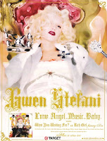
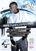

These are examples of magazine adverts from a variety of genres (Hip-Hop, Pop and Indie). My group and I had an idea that the artwork used on the Digipak and the artwork for the magazine advert were to be the same. This is a common convention throughout all genres. A good reason to do this is so the Digipak can be easily recognised by the public as they wont mix up images. This is useful as the genre of Hip-Hop usually reaches out to quite a niche audience, and so the use of the same image means that if different people see the same image, it will become more familiar and various people will remember it.
We are still to plan out our initial ides for both of the ancillary products, but we have already found and backed up our reasons for why we want to use the same image on both the magazine advert and the digipak.
FINAL digipak
 |
| Back Front |
I decided to change our idea from a 6 spread digi-pak to a 4 spread case. This way we would have more time to focus on the design ideas for the 2 main covers.
As you can see the same image was used for the front of the digi-pak as the magazine advert. This way a consistent trend can be seen and understood. Another theme that we have kept consistent is the usage of the same cross. This was used to display the trend of religion. Religion is a very well recognised aspect of hip-hop conventions. Furthermore, we felt that if we maintained the image of the cross throughout the main product and the ancillary products, it would enable the viewer to recognise that all the products are linked together with the same artist being 'Aim'.
Why were certain images chosen?
Whilst creating the digi-pak, i used photoshop to alter the two images. Different images were played around with before the final two images were chosen. For example with the cross, there were multiple images taken in various locations such as on the ground or the steps. However, we felt that this final image was the most powerful as the cross was displayed a lot clearer than the other images. Furthermore, the brick background displayed a beautiful red backdrop for our picture, again fitting the convention colours of hip hop as red is very prominent. With the front cover we decided to use the same image as the magazine advert as it is very common within hip hop to continue the theme from magazine advert to digi pak cover. This highlights the importance of keeping the audience familiar with the artwork of products. Also, the location of the image was very apt as it was taken on a graffiti backdrop which contributed towards the scene.
What types of effects were used through Photoshop?
With the front image involving our actress (myself) against a graffiti covered wall, the first effect that was chosen was adjusting the brightness to darken the image and playing around with the colours of the image to try and push it towards a red colour to match the image on the back of the case. I felt that it was important that the digi-pak looked like it matched together and that it had a reoccurring theme. After adjusting the image to darken it, i used a burn tool to add darkness to the actress' eyes. This was done because i felt that it was necessary that she looked dirty and rough in order for the audience to understand her story. We felt that this gritty image would fit our conventions as the woman would come across as being poverty stricken.
Whilst i was still using the burn tool, i added a bruise to her hand holding the cross. This continued the rough image. As i was bruising the hand in the front image, i had to ensure that i was bruising the hand in the back image also.
After the burn tool, i used a magic wand tool to select specific areas of the cross the actress is holding. I then chose to brighten these areas. This way there was a real contrast of a darkened background and a shining white cross. Furthermore, this meant we could really play on the theme of religion.
I chose to add the font for 'Aim' in large, bold, red letters as this would continue the conventions that we have used for our main products and ancillary products. Finally, i added the record label image used on the magazine advert and a 'parental advisory explicit content' label on also.
With the back of the digi-pak, the first thing i did was again darken the image. I also, played around with the colour saturation adding some more reds to fit with the front cover of the case. Afterwards i used the burn tool again to add some more bruising on the hand. This was very affective as the hand is very close up with the cross, therefore it is exposed well. Again, like before i used the magic wand tool to select specific areas to brighten on the cross. I did struggle with getting rid of the chosen sections but my teacher taught me to press ' ALT' then 'D' as it disabled the section that i was on. Finally, i added the fonts for the song titles and the spine of the digi-pak including a fan website. I chose white font for the back of the cover because it stood out the best on the red brick background. Furthermore, it fitted the conventions of using 2 colours. Red and white came up a lot during our research and we thought that it linked well into religion also to symbolise purity and evil. The same font was used here as the magazine advert continuing the theme. As this is a digi-pak i ensured that there were some added bonus features for the buyer.
Once all the text was added i placed a barcode on the back of the case for effect.
Overall i feel that the final out come of this product is extremely effective as it is apparent that we have chosen a consistent theme of colours, fonts, images and ideas.
Influences for our ancillary task
One of our main influences for our magazine advert and our digi-pak was our actual music video. We wanted to take elements from it and to include these ideas to go forth towards our ancillary tasks . As a group we took the idea of a religious symbol ( cross necklace) and did some research for religious elements in hip-hop/ rap genre. The magazine (Vibe) itself follows a niche market to the genre of hip-hop/rap so it was good to take some research on how each of their rap stars are portrayed on their cover.


As you can see, here is rap legend Eminem.The mise en scene for this particular advert includes a religious symbol ( a cross necklace) we also took the element of his defensive posture , so we were thinking of having Nia with her hands together, shoulders forward this could be interpreted by the niche audience in many ways, for our digi-pak and magazine advert this could make her seem like she's praying or she's trying to look threatening.

On the front of this cover 'Vibe' is the artist T.I. as a group we like his hand gesture and the contrast of the image ( this gave us a few ideas to experiment on photoshop with light and dark areas). The gesture with his hands linked in with the praying/ threatening concept , so we wanted to include the cross necklace dangling from Nia's hands to represent her wanting help because she suffers in the music video.

For our digi-pak we wanted to do a template of 6 so we could include different images and traits from our music video, 6 is common for a digi pak and most rap artists have 6 so we followed the conventions and didn't contradict them
Subscribe to:
Posts (Atom)