Analysis of a magazine advert with Ice Cube
- The artists' name is printed on the front of the cover. 'Ice Cube' printed sideways down the picture in a silver, edgy font. Along with the name of the album which is 'Greatest hits'
-The main image on the cover is half of the artists' face along with the writing of the album. At the bottom it mentions 'Parental advisory, explicit content'. The image seems timeless as it is in black and white and doesn't make any hints of the current trends or time. There are no other distractions or elements of colour in the image.
-The album does not show any evidence of the date of release or when it was released
-There is no evidence of any retailers on the album, therefore there is a possibility that it could be distributed anywhere, and there are no restrictions
-The artists' style is not clearly shown through this picture, however there is a slight hint of Ice Cube's attitude due to his facial expressions. There is no fuss in the picture which is typical with the artist as it is all about the music
-There is no set colour scheme of this album, but it is obvious that there will be a trend of simplistic colout without the fuss. Although there is no bright colours standing out to the audience, Ice Cube's face is iminent which could possibly represent the trend that is to follow with the music. ' Just music' and nothing else.
- Ice Cube's style and personality is displayed through this advertisement as he comes across as slightly intimidating and agressive in his picture.
- There is no additional information about additional artists due to star in the music tracks.
-
Friday, 30 September 2011
Explaining the music conventions of Pop music
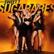
Explaining the music conventions of pop music, looking into Sugababes.
Sugababes are pop, girlgroup from England. They formed in 1998 with 3 different original members. This is a picture of their album cover ' Sweet 7' from 2010 released by Island Records, the bands record label. Their debut album, 'One touch' was released in 2001. Straight away the audience can identify with the genre due to the colours and the imagery on the album cover. For example the light and dark orange colours are playful and soultry, letting us know that the band are playful and non offensive. The outfits of the 3 girls are attractive and sexy. Moreover, they are easy on the eye. The girls are wearing black leather clothing. They all have slight variations of the other's outfit to indicate a team. The girls wear high heels which will play up to the 'girly' figure. The colour scheme of the CD cover is current and modern, attracting a younger audience. Pop is quite well known to try and aim at a younger audience, whilst being flirty at the same time. Here it is evident that the girls' outfits are quite explicit, however the tones of the CD cover play down the explicit tone of the group.
The album reached 14 in the UK and 25 in Ireland. One way of advertising the album was through youtube, where the first music video was previewed. Magazines also mentioned the album release as well as radio stations.
Track list of the album:
1. Get sexy
2.Wear my kiss
3.About a girl
4.Wait for you
5.Thank you for the heartbreak
6.Miss everything
7.She's a mess
8.Give it to me now
9.Crash and burn
10.No more you
11.Sweet and amazing
12.Little miss perfect
Website of the group : http://www.sugababes.com/ .Here on the website/fansite, the girls present their twitter usernames and information about the band that can help their fans.
The track name 'Wait for you' has intertextual referance of the film 'A cindarella story' which is girly and aimed a young audience.
Feedback from presentation
Positive feedback
- Good analysis for both music videos
- Liked our ideas for editing ( ideas for effects, transitions and shots)
- Good media terminology
-Good explanation on how the music videos have influenced our initial ideas
-Enjoyed class involvement - meaning we could get more feedback
- Looked at important factors within the genre ( mise en scene , editing , camera angles and location within the hip-hop genre)
Constructive criticisms
- Think about our location
- Linking to location, we have to think about time of day ( natural lighting)
- Think about cast members/ extras
- Give an exact role to all the extras
- Risk assesment
So throughout our blog and production we shall take into account of these criticisms, within the next few days we shall think about location, roles of actors and a risk analysis.
Thursday, 29 September 2011
Presentation on comparing two music videos to the genre Hip-hop/ rap
We decided to choose track 7 ( Aim- sunshine) the genre for this track is Hip-Hop/ rap/ soul. So for research we decided to compare two music videos of the same genre to help us produce our Music video!! ENJOY
Video no.1
Bell Biv DeVoe - Word To The Mutha !
- Ariel shot of location
- Transition of shot = Fade into next clip
- Band and extras (friends) walking towards the camera in the streets
Here you can see the different use of camera angles (ariel and moving long shot) and the different use of effects (colour to black and white. The black and white clip also had a single colour in it). Also in the last frame there is text scrolling along the bottom (crawl text). These use of techniques fit in well with the music video and genre.
As you can see here, there are continuous clips and scenes which include staircases.
It is common to see staircases leading into houses and buildings in America, and it is often seen in the videos for this particular genre as they are typically filmed in rural, homely areas. The staircase also acts as a platform and is normally linked with low angled camera shots to make whoever is on the staircases seem bigger.
It is common to see staircases leading into houses and buildings in America, and it is often seen in the videos for this particular genre as they are typically filmed in rural, homely areas. The staircase also acts as a platform and is normally linked with low angled camera shots to make whoever is on the staircases seem bigger.
Within these 6 images you can see the frequent use of low camera angles on the group members. The low angles make the person in the frame seem bigger, therefore giving off the idea they are more important. This is a common convention used within the Hip Hop genre.
After analysising the video, there are some ideas which we could link in with our video. Such as the low camera angles which seem to represent Hip Hop and the transition effects. Also the use of extras in the music video.
This is a diagram I did whilst analysing the video. This allowed me to note all the possible shots, locations, editing and mis-en-scene.
Video no.2
2PAC ft ELTON JOHN - GHETTO GOSPEL
Would you say this video represents the genre Hip-hop/rap very well?
What elements of the video supports this?
This is a music video for the genre Hip-Hop/ rap . In the video it portrays thug life and the consequences, we follow the character through his life and where he's grown up and the consequences he faces. My group and i decided that we liked the idea of following a certain character through the life stages and what demons they face. Typical hip-hop videos usually have fragamented linears ( his death at the begining) this makes the audience wonder what what happened?
Hip-hop/ rap usually has storylines of killings , drugs and violence. We might make use of one of these elements in our music video.
The camera uses a blur fade-out effect to show what happened before this is very effective and works also it creates tension for the audience.
The lighting for the video is quite dark suggesting an edgy feel to the music video and this may influence our video to be in black and white perhaps.
In this music video there are quite a few close-up shots this represents a close relationship between the camera ( audience) and the character creating an emotional attachment between the viewer and the video, 2pac's aims for the video is to end the war on the streets as he states in his lyrics addressing the futility of racial difference. This could be an important factor in our music video because the lyrics for our track Aim- Sunshine is quite a meaningful song.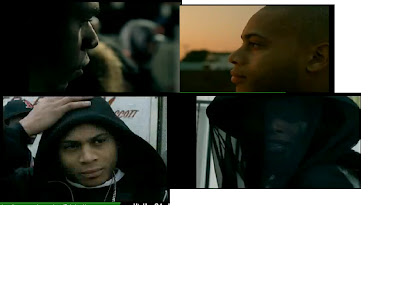

A wide - shot establishes the location that its in America and America has one of the highest rate in crime and violence.
Mise en scene
each shot represents poverty here are a list of the most things that occur in this video
- Gangs
- Dirty streets
- Hoodies and chains
- Religous symbols
-Buildings
- Cars
__________________________________________________________________________________
Wednesday, 28 September 2011
Track List
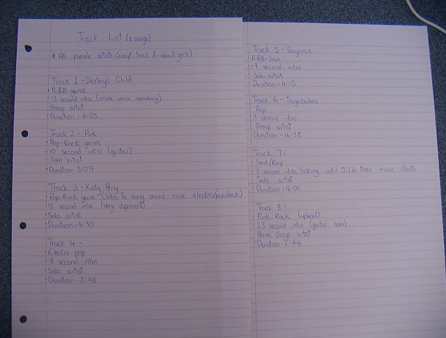
Today we were given a track list for the potential songs we could use to create our own music video to. In total there were 8 different songs, 7 of these being female artists, all from a variety of genres ranging from rock to pop to electro. Each song had a different feel to it and there was a few which stood out more than others. Overall, my group is trying to find a song where we can really show all of our media skills and try and include as many of these techniques as possible.
I took notes on certain factors within each track that I thought would be important. This included;
I took notes on certain factors within each track that I thought would be important. This included;
- Genre
- Intro duration
- Solo/group artist
- Duration
Monday, 26 September 2011
Conventions for a DigiPak and analysis
A DigiPak is a style of CD or DVD packaging. It is more advanced than a standard CD/DVD case which allows more space for graphics and text, and also may include added bonus features. It is typically displayed as a book-style case made mainly of cardboard.
Like a magazine advert, DigiPaks have similar conventions. Some of which may be present in certain genres more than others, with each genre having their own different way of adressing each convention.
Overall, the conventions of a DigiPak include...
Text
Like a magazine advert, DigiPaks have similar conventions. Some of which may be present in certain genres more than others, with each genre having their own different way of adressing each convention.
Overall, the conventions of a DigiPak include...
Text
- Name of artist
- Name of album/DVD
- Track list
- Price
- Website
- Credits
- Recording information
- Images of the artist
- Logo
- Barcode
- Website banner
- Artist genre
- Adverts
- CD or DVD
- Booklet
- CD/DVD case
Explaining the conventions of the music genre heavy metal
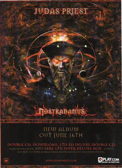
Judas Priest is a Heavy metal rock group from Birmingham they formed in 1969. Nostradamus is the title of their album cover and the date of the album release is out on the 4th of june. Straight away you can easily identify the genre of this particular band due to the colour scheme and the text font.
It uses harsh reds and dark colours , most heavy metal bands use these particular colour schemes because they usually represent blood ,death and hell! The font itself is a medieval gothic font , this particular font was established by barbarians in 440 d.c. who liked to deviate from the norm here is an example of a font.
The artwork itself is quite medieval this links into what is considered for the music genre heavy metal/ gothic rock, the drawing itself has been made to look old and ancient through editing and as I said previously the advert contains devilish/ satanic features with a bat incorporated in the band name and the suffering around the universe circles.
The band Judas Priest have many record labels but the one printed on the bottom- left cornor is their record label sony. The advert also contains the bands website at the bottom. Included in the the advert for their album they quote that you the buyer are given a exclusive deal that offers a double cd , where you can download it and get a free poster this is a classic advertisement trade where you get the customer/ audience to go onto their particular website whch would then lead them to certain tours and merchandise and so on...
Wednesday, 21 September 2011
Compare and contrast music analysis ( M.O.P and Justin Bieber)
I have chosen to analyse a video called 'Cold as ice' - M.O.P and another video called 'Baby' - Justin Bieber. M.O.P are a duo composed of Billy Danze and Lil' Fame from New York. They are involved in the Hip-Hop genre of music. The duo are famously known for their agressive delivery of music and lyrics which tends to be a regular occurance within the Hip-Hop genre. Justin Bieber is a young, pop / RnB artist from Canda. Justin was discovered on Youtube in 2008. He tends to follow the Pop genre within music, which has characteristics of light and fun living.
Mise en scene is French and tends to mean, the placing of the stage, I.e. what is in the frame. It involves everything that is in the frame such as lighting, actors, costume and make-up, staging of objects, props, compositions and staging of actors. For some, Mise en scene can involve the emotional meaning of the frame, or the elements of visual style.
In Hip-Hop there tends to be a typical Mise en scene of dark, possibly threatening lighting. This is evident in M.O.P’s ‘Cold as ice’ where the lighting is very low to encourage you to be intrigued about the content of the video. However, in Justin Bieber’s ‘Baby’ the lighting is incredibly bright, the complete opposite to a Hip-Hop video. He is surrounded by a strip of lights in the street and the colour scheme of the video is light blue unlike M.O.P’s theme of black. In the studio scenes, the lighting appears slightly darker to ‘set a scene’, however, it is still significantly lighter than M.O.P’s choice of lighting. This helps the audience decide whether the video is going to involve a positive atmosphere or negative.
Within Hip-Hop, the actors tend to look very aggressive and intimidating and any actresses, if not the artist, tend to be sexually provocative to promote notions of looking. They tend to have little amount of clothing and dance sexually towards the audience or the actor involved in the scene, just like in M.O.P’s video. All the woman are wearing tight clothing to expose various parts of their body for the camera. For costume, the males tend to have low riding trousers exposing their underwear. They may also be wearing vests or t-shirts with flat cap hats, all of dark colour. This is to display an image that ‘doesn’t care’ about anyone’s opinions. The artists may also be wearing expensive jewellery.
For example in M.O.P’s video, both artists are wearing dark, heavy clothes with flat caps and tight black hats. This all black image, gives us the audience, a feeling that these may not be the most approachable men. The women in the video are wearing fur coats to cause controversy and not much else, whereas in Justin Bieber’s ‘Baby’, himself and all the actors and actresses are all dressed in incredibly bright clothing that suggests a youthful element to the video. The colours clash and are slightly harsh on the eyes as the colours pop, but it is clear that the point of the video is to make the audience feel happy afterwards instead of any aggression.
In many hip-hop videos, there are reoccurring props of expensive alcohols such as champagne, potential drugs to display rebelling, dice for gambling with, or expensive vehicles. In M.O.P’s video, there is the reoccurring image of ice to fit in with the music title ‘Cold as ice’. There aren’t many props in the video apart from chains hanging from the ceiling and expensive cars. This helps the audience focus more on the aggressive lyrics that the rappers are spitting at them. In ‘Baby’, props include bright lights, guitars, bowling balls and pins to suggest a playful element.
Most pop videos have a playful element, unlike Hip-hop videos which play on the aggression and anger of the actors towards the audience.
The shots in Justin Bieber’s ‘Baby’ tend to be wide shots that focus on the party scenes of the video showing teens dancing and singing at a bowling alley, clearly having fun. The only Close Up shots are of Justin Bieber and his ‘love’ to expose the emotions they feel towards each other, helping the audience piece together the narrative. The shots are similar in a hip hop video to pop, like M.O.P. However, although the shots are similar, the music artists display completely different emotions. M.O.P display anger and threatening behaviour in comparison to a light hearted love scenes with Bieber.
The effects in M.O.P’s video are abrupt and quick. The shots that transcend slowly involve the female dancers; this adds a mix of sexual content that switches quickly back to the angry cuts of the rap artists. In Justin Bieber’s video, the transitions of the shots are much slower and drawn out, to add to the effect of yearning for someone and being sad in love. This is the complete opposite to the ‘Cold as ice’ video.
Also, the tempos of music are very differentiated. In hip-hop, the music is well known to be quite slow but have a heavy baseline that accentuates the rap lyrics- like ‘Cold as ice’. The lyrics for M.O.P are slow and very pronounced so that the audience are fully aware at what the artist is saying. However, in pop it tends to be the complete opposite. For example, Justin bieber’s video is extremely upbeat even though it is displaying lyrics of upset and sadness, the tempo still keeps the rhythm upbeat.
In conclusion, from the two videos I’ve displayed on the blog, it is clear to see that both the videos are very opposite. The lighting, costumes, lyrics, tempo of music and effects all contribute towards the different type of genre. M.O.P’s track ‘Cold as ice’ comes across as very aggressive and agitated, whereas Justin Bieber’s ‘Baby’ is very positive and up-beat even though he is singing about something that is troubling him. Whilst analysing these videos, it helped me categorise the types of music video a particular genre may have.
Conventions of a magazine advert compared to two different genres
There are particular codes for a magazine advert, these codes are ;
The name of the band is 'BAND OF SKULLS'. The genre for this band is alternative rock.
Date of album release- New single 'fires' out now!
The image and style of the advert is quite abstract , the image itself has been drawn , it has a vibrant orange colour against a black background so the imagery really stands out. The artwork on the advert is rather sharp it works well with the bold white writing so both image and writing stand out and they don't overwrite eachother. Also within the advert it has the image of the actual album in the centre to help the audience recognise their partucular album because some artists dont have the same background/image of their album. On the magazine advert it has their main website page and a myspace at the bottom of the advert.
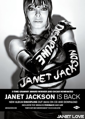 In comparison to the alternative rock genre , here we have Janet Jackson she falls under the genre RnB,pop and dance. On her magazine advert it has the date of her album release ' Discipline' which is on the 25/02. The image and style of the advert is provactive and sexual. The mise en scene in this picture is a white background focused on her outfit , she is wearing a provocative bra and latex leather gloves it links in with the title of the album 'discipline'. The contrast of the image is black and white this highlights the outfit she's wearing this follows the conventions of a typical RnB advert because most of the women hardly have clothes on because they portray a sexy - seductive image, this may be influenced by the record company ( island). On the advert it includes the two singles from the album 'feedback' and 'luv and its available on CD and download'. The poster contains a critic quote from touch magazine " she's got her groove back" and it quotes her as a 5-time grammy award winner and oscar nominated and on the bottom left it has her website at janetjackson.com.
- Name of band/ artist and album
- Date of album release
- Band/artist image/ style
- Featuring songs
- Form of release (CD, download)
- Either photograph or artwork as main image
- Record company
- Bands website – myspace /official page
- Critical quotes, ratings
- Set colour scheme
The name of the band is 'BAND OF SKULLS'. The genre for this band is alternative rock.
Date of album release- New single 'fires' out now!
The image and style of the advert is quite abstract , the image itself has been drawn , it has a vibrant orange colour against a black background so the imagery really stands out. The artwork on the advert is rather sharp it works well with the bold white writing so both image and writing stand out and they don't overwrite eachother. Also within the advert it has the image of the actual album in the centre to help the audience recognise their partucular album because some artists dont have the same background/image of their album. On the magazine advert it has their main website page and a myspace at the bottom of the advert.
 In comparison to the alternative rock genre , here we have Janet Jackson she falls under the genre RnB,pop and dance. On her magazine advert it has the date of her album release ' Discipline' which is on the 25/02. The image and style of the advert is provactive and sexual. The mise en scene in this picture is a white background focused on her outfit , she is wearing a provocative bra and latex leather gloves it links in with the title of the album 'discipline'. The contrast of the image is black and white this highlights the outfit she's wearing this follows the conventions of a typical RnB advert because most of the women hardly have clothes on because they portray a sexy - seductive image, this may be influenced by the record company ( island). On the advert it includes the two singles from the album 'feedback' and 'luv and its available on CD and download'. The poster contains a critic quote from touch magazine " she's got her groove back" and it quotes her as a 5-time grammy award winner and oscar nominated and on the bottom left it has her website at janetjackson.com.
 How the two genres differ from eachother
Alternative rock tends to have more artwork and not having the picture of the bands themselves, whereas for the genre RnB and pop it tends to have the image of the actual artists.
In comparison to main-stream music it tends to be pop/RnB artists rather than alternative bands but not always the case.
RnB/ pop artists tend to have more of a sexual image or a certain trend which changes throughout their career due to the fashion and copying other artists. Unlike the alternative rock genre they tend to have the same trait that follows all the way through their career i.e dark clothes , tattoos and some alternative rock music artists wear make-up aswell.
Both genres tend to have a niche audience - Janet jacksons audience would be audiences that like to dance so her music will be generated at clubs and on mainstream radio stations. Band of skulls would have an audience that like to go to rock concerts and follow certain traits like clothing and tattoos.
Conventions of a magazine advert
Although magazine adverts for music artists should follow certain conventions, they may differ depending on the different genres. These are the typical factors which a magazine advert may contain...
-
- The name of the band/artist
- The style of the artists
- Date of album relsease
- Featuring songs on the album
- Form of relsease (mp3 download/CD)
- Photography or artwork
- How is the artist being portrayed in the advert
- Record company mentioned
- Website for the artist
- Quotes/ratings from other sources
- Colour scheme
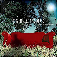
Although a magazine advert doesn't have to include all these conventions, it should still contain a few important factors to ensure enough detail is given to the audience who will see the advert. I have chosen to compare two different genres and how their magazine adverts differ from another or show similaries. Gwen Stefani's 'Love. Angel. Music. Baby.' which would be classified under 'R&B, Pop and Electro' and Paramore's 'Brand New Eyes' which would be under the genre of 'Alternative Rock and Pop Punk'.
| Paramore - Brand New Eyes |
The name of the artist: Both the adverts have the artists name clearly displayed on them. This is expected from any promotional advert. However the title for Paramore's is a lot clearer than Gwen Stefani's The difference shows the simplicity of one artist against the quirky, stylistic side of the other. What I also noticed is the continuentcy on the Paramore adverts for their font and size. This could be linked with their ongoing style which is similar throughout their musical career. On the other hand, Gwen Stefani has many different fonts and sizes to show her name on adverts and albums. This could be linked with the ever changed style of the Pop genre which she is famous for.

As you can see here from a few more examples of their album artwork the font for Paramore stays the same, even though others words and phrases may be in a different font. This shows that Paramore are keeping to a certain style which represents them and holds as a signiture. Whereas Stefani has completely different fonts, suggesting the change in music and style.
Date of album release: There is no apparent date on the magazine advert for Stefani's album release, although this may be a marketing plan as it does show where you can purchase and download the album which would mean people would have to search themselves for the download or go in store where they are more enclined to browse and buy more items. Paramore, on the other hand, have text which says 'ALBUM OUT NOW!'. This allows the viewer to buy the album immediently. This too could be a marketing ploy due to the genre not being as well known as Pop and R&B (like Stefani), so people may need to be notified and reminded that they have an album out. Unlike Stefani who is both popular and, at the time, was in the charts. So the audience was constantly reminded of her music.
Photography/Artwork: In Paramore's magazine advert they have a mix of both a photograph and artist effects. The image of the band is the main focus which include all the members of the band, with the main singer at the front. The background of the image is of a plain, brown wall. However, this then links in with the rest of the advert which is artist effects. There is a wooden background with butterflies at the bottom. The butterflies are the same as the front cover of their album which is being advertised. This advert shows how 'natural' the band are and supports the fact that their music is not electronic or edited music, it is also natural. On the other hand, Gwen Stefani's advert is a zoomed in version of her album cover. Although the image itself has been manipulated on a photography software, it is evident that the picture is of Stefani herself, holding a crown and a PIMP STICK (?!). This could symbolise her being 'the queen' of pop music.
How is the artist being portrayed: Stefani is portrayed on her magazine advert as being 'the queen' of pop. She has had many albums and is well known within, not only her specific genre, but throughout the entire music industry. In the image she looks laid back and relaxed as she slumps in the throne. This could show how her music is quite easy to listen to. Another way Stefani and her music is being portrayed is through the effect used to manipulate the image. It looks almost liquified and distorted, showing how, although her music may be easy and fun to listen too, is also quite edgy and different. The other advert for Paramore shows how the group are together. The piano indicates their passion for music, the band all together shows how they are commited to one another and their closeness and then also the quirky pose from their main singer (Hayley Williams) which could mean they were quite 'out there' and a bit different. Another important factor which portrays the band well is that they address the audience as a single indiviual. By using the phrase "YOUR FAVOURITE BAND IS BACK" it speaks directly to their audience and makes the listeners of their music feel like they have more of a connection with the band. Paramore's advert appears a lot more friendly and appealing to their fans than Stefani's advert, this may be due to the fact that Paramore's genre is a lot smaller and have a niche audience which they are proud of.
Colour scheme: In this particular magazine advert for Stefani, the main colours are gold, white and pink. There isn't a vast variety of colour but they do all blend together well and there's isn't a massive contrast. The colour sceme is soft, light and almost angelic like. The bight and high key colours reflect her music in a way that shows she is upbeat and positive. In the other advert for Paramore, they have a different use of colours. In their magazine advert they use mainly quite 'earthy' colours such as brown, orange and black. These colours aren't typically seen as upbeat, but resemble the band well with their 'natural' music.
INTRODUCTION TO PHOTOSHOP CLASS NOTES
These are the notes I took down in class on how to use certain features on Photoshop. The programme we shall all be using is Photoshop CS4. Although I have had previous experience in using Photoshop I found it really beneficial to look at how to use certain tools and functions which I know I could use in the DigiPak and magazine cover.
Monday, 19 September 2011
Comparing/contrasting two different genres
The genre's I will be comparing is Classic jazz and rock 'n' roll , quite a contrast. Following on representing classic blues I shall be contrasting and comparing Sarah Vaughan with rock 'n' roll band The Rolling Stones.
 Two very different genres... Sarah vaughan is an American jazz singer during the 1940's this was during a time where jazz was becoming a phenomenon she has been a high influence in the jazz world from the likes of ella fitzgerald and such recent artists like Amy Winehouse. She was one of the main influences of jazz. During the 1940s, women were given a new image of a sassy look this look was influenced by jazz singers like Sarah, they would wear flawless dresses, hats, pearls and diamond earrings.
In comparison The rolling stones inspired the whole rock n roll movemnet in the 60's , who also inspired a whole new generation, To enforce rock n roll. People would go out in ripped denim jeans and leather jackets, everyone wanted to be like the rolling stones to experience the life of being a rockstar! The stones consisted of Mick Jagger , Keith Richards, Ronnie Wood and Charlie Watts.
Both artists
Photoshop run
This is my image that i created through Photoshop CS4. I used two separate images - a sunflower and an orange. Once you copy and paste one image onto another, different labels are created. This means you can individually work on the images separately, rather than only being able to adjust the picture as a whole. With the orange, i added a blurring effect and smoothed the edges to make the white parts appear smaller. With the sunflower, i added an artistic water paint effect to blur the edges but keep the effect different to the orange.
To cut around the orange to make a smooth edge, i used the freehand lasso tool, but it would have been easier and neater to use the circular marquee tool. To ensure the sunflower and orange fitted together, i had to then use the circular marquee tool to cut a shape in the centre of the sunflower to accommodate the orange's shape. Once the hole was cut out in the sunflower, i copied and pasted the orange shape onto the sunflower. As there were only two images, i only used two labels for my picture. The main tool i used was a blurring tool, this way any messy edges were neatened up, and the two images came together as one. I chose a sunflower and and orange as they had no relation to one another and i wanted to pull them together into one image.
We participated in this photoshop workshop to improve our skills in media in preparation for our ancillary task. Our ancillary task involves designing a poster/magazine cover/ CD cover. Figuring out photoshop was useful for myself and my group, in order to ensure our creations were more interesting and creative.
Introduction to Photoshop
Using Photoshop CS4 I was able to create this image. This was done by taking two seperate images from Google images and putting them in seperate layers.
I used the image of the owl as my main background and used the circle marquee tool around the eyes to make a perfect circle. Then I moved and deleted this section to make space for a new layered background. On a new layer was the space image which I then used the Marquee tool again to cut a circle. I chose a busy area on the space image to work with to make the 'new eye' seem more interesting. I had a bit of trouble trying to blend the space image with the eye but after a lot of tria and area I was able to make it fit. I done this by simplying selecting the correct layer and then copy and pasting the space image onto the oringal background layer. However, the new space image was in the foreground, and the eye didn't look very realistic. To fix this promlem I moved the layers around so the added layer was now in the background.
Once I had put the space image in place with the owl's eyes I began to experiment on different effects and techniques that Photoshop had to offer. For the body of the owl I wanted a black and white effect so the eyes would stand out more. I used the Filter Gallery and played with different effects such as 'tiles' and 'blur', eventually chosing the 'sketch' effect to make the owl black and white with a vintage feel. For the eyes, I wanted to try different effects for each to make it look more creative and to try other effects. For the right eye you can still visibly see what the image is, although I did add a grain effetct from the Filter Gallery. The left eye it is clearly distorted. This was done by the 'stained glass' effect, also within the Filter Gallery.
We did this task in class to introduce us to Photoshop and the techniques we will be using in our ancillary task (create a DVD cover and a magazine cover). It was interesting to see the various different effects and it gave my group and I an idea of what we could do when producing and editing on Photoshop.
Compare and contrast music analysis (Britney Spears & Laura Marling)
I have chosen to analyse a video each by Laura Marling (Folk genre) and Britney Spears (Pop genre). Both are solo females artists who are very popular within their own genre and represent their style through their music and videos. The two videos are Sophia (Laura Marling) and I Wanna Go (Britney spears), both of which are their two latest music video so I would only be comparing their most recent work as it would be unfair to look at videos from different times as technology and music have both changed.
Tempo
Lighting
Colour scheme
Editing
Transition of shots
Effects
Lighting
Colour scheme
Editing
Transition of shots
Effects
Friday, 16 September 2011
Analysis of Kanye West's music video 'Power'
Close up - Kanye West's head and shoulders close-up creates a powerful and threatening image which emphasises visuals to lyrics ( because the song is called power) also gives him a god-like figure.
The music video consists of one continuous shot in which the camera slowly zooms out of the frame, but still keeping Kanye the main focus for the audience this represents power. When the frame becomes a wide shot, as an audience we see all the characters this was done via a cutaway shot and a dolly zoom to highlight the other characters the main message of this video is power ( being Kanye) surrounded by decedance and sexuality and death of others, the wide shot challenges that position of power.
In this music video there has been no cuts and the characters do not have the same duration as the track ,phantom cameras were used to create super slow-motion the whole image itself is fantastic and symbalises a moving painting. Intertextual reference is made to 17th century art , the start of the broquet era where in these paintings you can see elements where the video has taken from, for example the naked bodies women and murder. As seen below in Ruben's massacre of the innocence.
The editing in this music video is incredible, filming each character and fitting in the 360 degree frame as you can see below all the shots that were taken for the music video.
Auteur Theory
The word 'Auteur' is originally a french word meaning author , An Auteur is considered to be a director who illustrates their signature work into music videos these are usually visual elements which consist of three theory points.
Auteur theory 3 elements
1.) Individual stylistic features - This is the auteurs signature which features throughout the videos they direct, not all directors are auteurs, Auteurs want their work recognised so with a repetitive signature it is easier for the audience to identify their creative work.
2.)How texts are determined by artists creativity - Not all Auteurs are creative! , some Auteurs are recommended due to popularity and this will appeal to a niche audience, Hype Williams is a renowned auteur whos creativity flows within the RnB sector.
3.)How texts emerge as part of an artist's body of work - Auteurs not only use visuals to illustrate their signatures but sometimes the artist's are directed to wear specific clothing or dance in a certain way to reflect upon the auteurs style.
Across the music video industry Auteurs have made their mark by the use of recognisable signatures , these signatures could be forms of anything such as the following;
~ Colour
~Transitions
~Use or absense of narrative
~ Location
~ Actors
Thursday, 15 September 2011
Jonathan Glazer - Auteur
The Auteur Theory is when the writer has a specific signature that they use within their work which can be apparent to its audience. Elements of this theory may include individual stylistic features, how the texts are determined by the artists creativity and also how texts emerge as part of the artists body of work. A few examples of where the recognisable features may be found in a video/film is through colour, locations and actors etc.
And I also took notes on other points which I thought stood out in the particular videos.
The three videos I analysised were...
After looking at certain aspects of each video I started to notice certain trends forming and became to realise what it was about Glazer that gave him the title of 'Auteur'. As you can see from my notes above, the most commonly used factor is the use of lighting and white rooms.The use of these white rooms was not obvious and didn't seem to provide any obvious linking reason.
Jonathan Glazer
Glazer is an English director from London, known for his television commercials, music videos and directing of films (most commonly known for his Nike commercials, Sexy Beast film and music videos for Radiohead and Jamiroquai)
After watching a few of his music video, it was not apparent to me what Glazers media signature was. I decided to analysis certain features of his videos to see if I could notice any reoccuring patterns. I look at areas such as:
- Genre of music that we worked with
- Lighting used
- Colour schemes
- Location of video
- Editing
- Structure
The three videos I analysised were...
- Jamiroquai - Virtual Insanity (1996)
- Blur - The Unversal (1995)
- Richard Ashcraft - A Song For The Loves (2000)
After looking at certain aspects of each video I started to notice certain trends forming and became to realise what it was about Glazer that gave him the title of 'Auteur'. As you can see from my notes above, the most commonly used factor is the use of lighting and white rooms.The use of these white rooms was not obvious and didn't seem to provide any obvious linking reason.
Goodwin's Analysis
I have chosen to look at a music video by the artist Noah and The Whale called Our Window. I shall be looking to see if the video demonstrates any of the key features shown in Goodwins Analysis. The main aspects I will be looking for are...
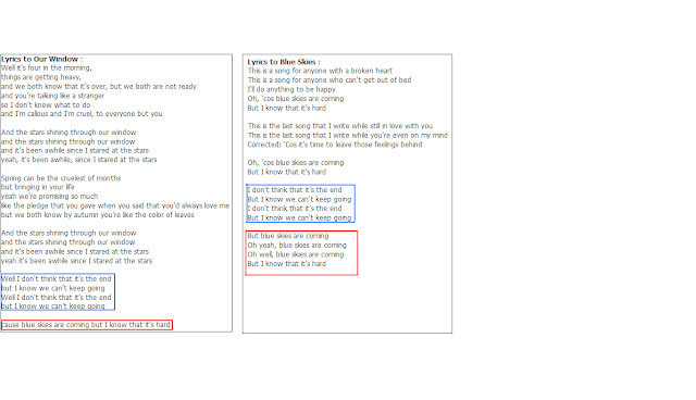 Intertextual Reference: Within the song Our Window, the lyrics also link in with another song by Noah and The Whale called 'Blue Skies'.
- If the lyrics and visuals link
- Notions of looking
- Structure
- Demands of the label
- Genre characteristics
- Intertextual references
Structure: The structure of the video is narrative linear. It tells a story from start to finish of a man who wants to break up with his girlfriend. It is very obvious and clear what is happening in the visuals even though it may not entirely link with the verbal. Not only is this video a narrative linear, but all the songs from the album 'First Day Of Spring' were made into a video which links together to make a small film. As you can see in the image below, the same man has been used as the main character to show the contingentcy of the storyline (Top left - Our Window, top right - bottom left - Stranger, bottom right - Blue Skies).
Genre Characteristics: Noah and The Whale would be classed under the genre of folk/indie. They are commonly linked with other musical artists such as Laura Marling and Mumford and Sons, etc. Although this genre of music is not as mainstream as other genres, they do still have signature characteristics. Generally, these types of music videos are simplistic, have a calm feel to them, a lot of close up shots of the artist and objects, plain colour schemes and the location of the video is normally a quiet area.
 |
| Mumford And Sons - The Cave |
 |
| Laura Marling - Devil's Spoke |
As you can see in both of these screenshots from the same genre of Noah And The Whale, they both include natural, quiet surroundings. This can be linked with their music with is also quite natural and quiet sounding.
 Intertextual Reference: Within the song Our Window, the lyrics also link in with another song by Noah and The Whale called 'Blue Skies'.
 Link between visuals and lyrics:
I didn't notice any clear links between visuals and lyrics. However, I did take note that the lyrics were very calming and not dramatic at all. This was conveyed in the visuals, which were also very calming. For example the locations outside in a field which is natural, and also the mellow use of colours with mid/high key lighting.
Subscribe to:
Comments (Atom)


