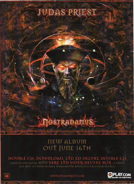
Judas Priest is a Heavy metal rock group from Birmingham they formed in 1969. Nostradamus is the title of their album cover and the date of the album release is out on the 4th of june. Straight away you can easily identify the genre of this particular band due to the colour scheme and the text font.
It uses harsh reds and dark colours , most heavy metal bands use these particular colour schemes because they usually represent blood ,death and hell! The font itself is a medieval gothic font , this particular font was established by barbarians in 440 d.c. who liked to deviate from the norm here is an example of a font.
The artwork itself is quite medieval this links into what is considered for the music genre heavy metal/ gothic rock, the drawing itself has been made to look old and ancient through editing and as I said previously the advert contains devilish/ satanic features with a bat incorporated in the band name and the suffering around the universe circles.
The band Judas Priest have many record labels but the one printed on the bottom- left cornor is their record label sony. The advert also contains the bands website at the bottom. Included in the the advert for their album they quote that you the buyer are given a exclusive deal that offers a double cd , where you can download it and get a free poster this is a classic advertisement trade where you get the customer/ audience to go onto their particular website whch would then lead them to certain tours and merchandise and so on...
No comments:
Post a Comment